Southern Hospitality Logo
We are proud to announce an update to our Southern Hospitality Corporate Logo
When we started our business over 30 years ago, we sold a small range of tableware, kitchen hardware and equipment. Our customers were Chefs and Front-of-House Staff and our logo reflected this well.
Now in 2020 our business is very different. Our customers have guided us towards a ‘one stop shop’ business model. This is represented in many areas or our business, some examples are:
- Projects - how we combine our expertise to deliver successful projects.
- Product Range - our range has extended to represent the majority of items you are likely to require.
Our existing logo with it’s ‘clip art’ styling looks old fashion and no longer represents the modern company we have developed into.
 In 2019 we moved away from our SHL Design & Build logo and introduced the new SHL Projects logo, you will note the use of our Southern Hospitality coloured circle. The colours of this circle represents how we combine different elements of a project in a seamless way - this also relates to the interactions between the different areas of our business or perhaps how we bring together best practice, legislative requirements, specialist skillsets and industry experience to our projects.
The colours on our Southern Hospitality circle relate well to other areas of our business, some examples;
Customers - 30 Years ago we worked with Chefs and Front-of-House, we now deal with customers from many different professions; Architects, Corporate Customers, Supermarkets, Builders and Construction Companies, Government, etc. Not only this but the Southern Hospitality Circle also represents the fact that our customers now come from many more ethnic backgrounds than they did 30 years ago.
Our People - Our business has never been so diverse; we now have staff from all corners of the world. The different backgrounds of our people add to our ability to think differently and be open to changes in our ever-improving business.
Product Range - We see the SH circle also representing our complete range. Our Customers have driven our product sourcing strategy through their desire for a complete one stop shop. Not only is our range vast but we now source the best product from countries across the word….and in many instances the best is from right here in NZ!
Channels to market - The Southern Hospitality Circle represents our different channels to market. Our customers interact with us in many ways, we will continue to ensure we invest and adjust this to suit our customer requirements.
Our new logo features a more colourful, modern design with the new Southern Hospitality circle to represent the diversity of our customers, our people, our product range and the different areas of our business.
![]()
Today, we take a moment to look back and celebrate as we say goodbye to the old Southern Hospitality logo which has served us well for over 30 years.
Our utmost thanks to our valued customers, we look forward to many more years of dedicated service and partnership with you.
As the winter approaches and the air starts to ...
The season of gratitude and celebration with fr...

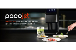
In November 2022, it was announced Southern Hos...